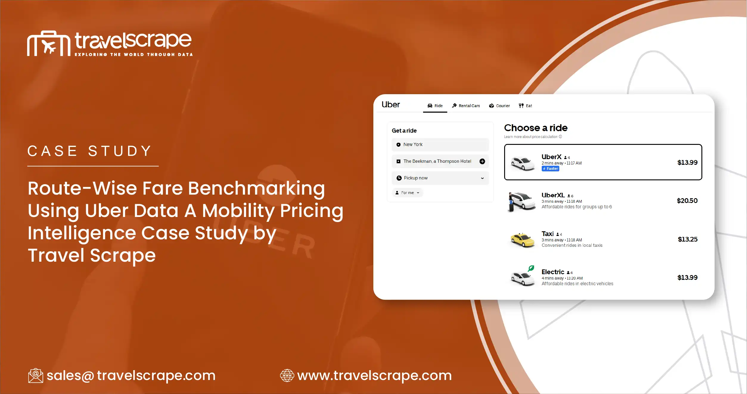
Route-Wise Fare Benchmarking Using Uber Data A Mobility Pricing Intelligence Case Study by Travel Scrape

Introduction
Urban mobility pricing is no longer static. Ride-hailing platforms adjust fares dynamically based on demand, congestion, time of day, weather, and local events. For mobility analytics firms, investors, and pricing teams, understanding these fluctuations at a route level has become essential.
Airport routes, central business districts, and residential corridors behave very differently from a pricing perspective. Yet many organizations still rely on aggregated averages or monthly summaries that hide real pricing signals.
This case study explains how Travel Scrape helped a mobility analytics firm build a route-wise fare benchmarking system using live and historical data from Uber. The result was a clear, data-driven view of surge behavior, peak vs off-peak pricing gaps, and city-level fare positioning.
Business Challenge
A global mobility analytics firm approached Travel Scrape with a specific problem.
They wanted to answer questions such as:
- How much do airport fares increase during peak hours compared to off-peak?
- Do congestion and longer ETAs always translate into higher fares?
- How does fare per kilometer vary across cities for similar routes?
- Can pricing patterns be standardized into a reliable index for comparison?
Despite having access to high-level ride data, their internal teams lacked route-specific and time-granular visibility.
Key Gaps Identified
- No Route Standardization Fare data was collected across random trips, making it impossible to compare apples to apples.
- Limited Surge Transparency Surge pricing appeared in the data, but without context around time windows and route types.
- Poor Peak vs Off-Peak Analysis Aggregated daily averages masked sharp fare swings during rush hours.
- City Comparison Was Unreliable Without normalized routes and distances, city-wise pricing comparisons were inconsistent.
The firm needed a repeatable, scalable, and defensible fare benchmarking model.
Solution by Travel Scrape
Travel Scrape designed and executed a route-wise fare data collection framework that focused on consistency, frequency, and comparability.
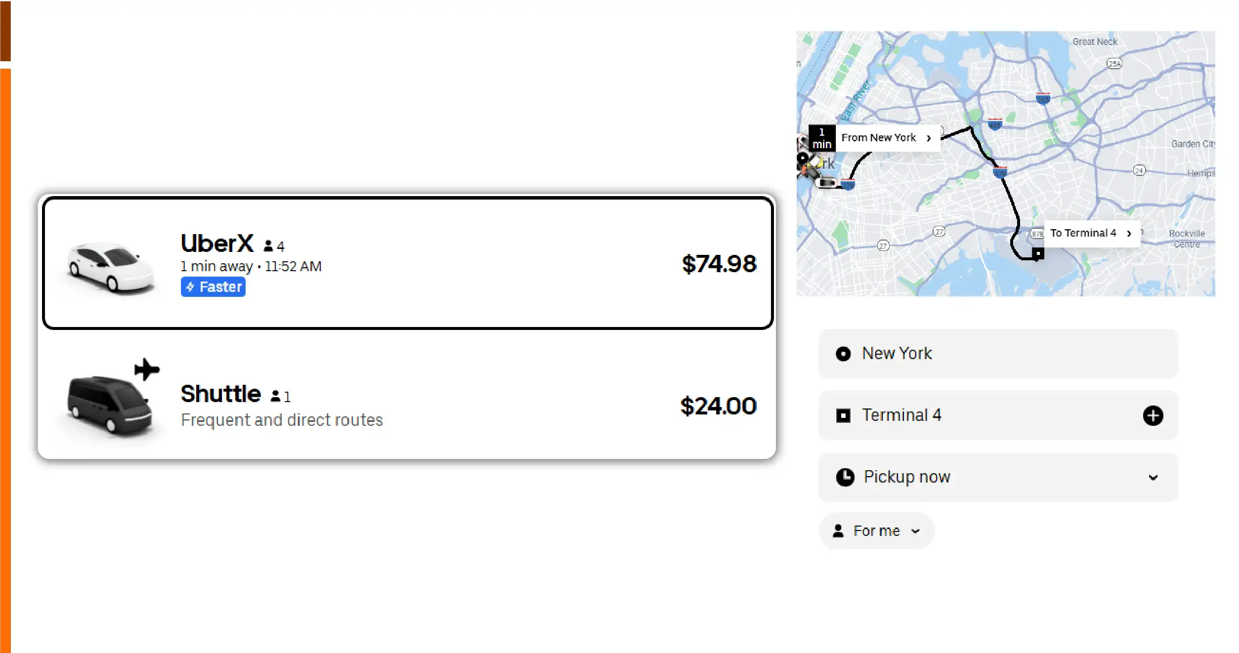
Instead of tracking random rides, the solution was built around fixed pickup and drop-off points across defined route categories.
Route Categories Defined
To standardize analysis, three core route types were selected:
- Airport → Central Business District (CBD)
- CBD → Residential Zones
- Residential Zones → Airport
Each route category was mapped using precise geo-coordinates to ensure distance consistency across data pulls.
Data Collection Methodology
Travel Scrape implemented a structured and automated data collection pipeline.
Fare Capture Strategy
- Hourly fare quotes collected
- Coverage across weekdays and weekends
- Multiple time windows including:
- Morning peak
- Midday
- Evening peak
- Late night off-peak
Data Points Extracted
For each fare quote, the following attributes were captured:
- City
- Route type
- Time slot
- Distance (km)
- Estimated fare
- Estimated Time of Arrival (ETA)
- Timestamp
- Day type (weekday or weekend)
This approach ensured that each data point was context-rich and analytically comparable.
Sample Data Collected
Below is a simplified example of the dataset delivered to the client.
| City | Route Type | Time Slot | Distance (km) | Fare (USD) | ETA (min) |
|---|---|---|---|---|---|
| NYC | Airport → CBD | Peak | 28 | 62.50 | 9 |
| NYC | Airport → CBD | Off-Peak | 28 | 41.80 | 6 |
| NYC | CBD → Residential | Peak | 12 | 29.40 | 11 |
| NYC | CBD → Residential | Off-Peak | 12 | 21.60 | 8 |
| NYC | Residential → Airport | Peak | 26 | 58.90 | 10 |
This structured format allowed pricing teams to perform direct route-level comparisons without normalization errors.
Analytical Framework Applied
Travel Scrape didn’t just deliver raw data. The dataset was designed to support advanced analytics.
Key Metrics Calculated
- Fare per kilometer
- Peak vs off-peak uplift percentage
- Surge intensity index by route
- ETA to fare correlation
- City-wise fare competitiveness score
Example: Surge Uplift Calculation
For Airport → CBD in NYC:
- Peak fare: $62.50
- Off-peak fare: $41.80
Surge uplift:
Approximately 49.5% increase during peak hours
Key Insights Uncovered

1. Airport Routes Showed Consistent Surge Patterns
Across cities, airport routes demonstrated the highest surge sensitivity.
- Peak hour uplift ranged between 30% and 45%
- Evening peaks were more expensive than morning peaks in most cities
- Weekend airport fares were often higher than weekday off-peak fares
This insight allowed the client to model predictable surge thresholds instead of treating surge as random behavior.
2. Congestion Increased ETA More Than Fare
One surprising finding was that congestion did not always scale linearly with price.
- CBD routes showed significant ETA increases during peak hours
- Fare increases were moderate compared to time delays
- Fare per kilometer remained relatively stable in congested zones
This highlighted that time-based inconvenience does not always translate into proportional fare increases.
3. Fare per Kilometer Stabilized During Off-Peak Hours
Off-peak pricing across cities was remarkably consistent.
- Lower fare volatility
- Minimal surge multipliers
- Predictable cost per kilometer
This made off-peak data ideal for baseline pricing benchmarks and cross-city comparisons.
4. City-Wise Price Positioning Became Clear
With standardized routes, the client could finally rank cities accurately.
- Some cities showed high base fares but low surge volatility
- Others had aggressive surge pricing despite lower base rates
- Airport connectivity quality correlated strongly with pricing stability
These insights were previously impossible using unstructured ride data.
Business Impact
The route-wise benchmarking solution delivered measurable value across multiple teams.
For Pricing and Strategy Teams
- Enabled data-driven surge modeling
- Supported dynamic pricing simulations
- Identified routes with excessive volatility
For Investors and Analysts
- Created a city-level fare competitiveness index
- Enabled side-by-side comparisons across markets
- Improved confidence in mobility investment evaluations
For Product and Ops Teams
- Highlighted inefficiencies in high-ETA, low-fare routes
- Supported better service-level planning
- Informed route prioritization strategies
Scalable Pricing Index Creation
Using Travel Scrape’s data, the client built a repeatable airport pricing index.
This index became a reference point for:
- Quarterly mobility reports
- Investor presentations
- Market entry feasibility studies
- Competitive benchmarking against other ride-hailing platforms
Because the data pipeline was automated, the index could be refreshed daily, weekly, or monthly.
Why Travel Scrape
Travel Scrape specializes in high-frequency, structured travel and mobility data extraction.
What differentiates Travel Scrape:
- Route-level data precision
- Time-window based fare tracking
- Scalable multi-city coverage
- Clean, analysis-ready datasets
- Custom benchmarks and indices
Whether the goal is pricing intelligence, investment analysis, or operational optimization, Travel Scrape delivers actionable mobility data at scale.
Conclusion
This case study demonstrates how raw ride-hailing data can be transformed into a strategic asset when collected and structured correctly.
By shifting from random fare pulls to route-wise, time-based benchmarking, Travel Scrape enabled a mobility analytics firm to uncover hidden pricing patterns, model surge behavior, and compare cities with confidence.
For organizations operating in transportation, mobility analytics, or urban planning, route-level fare intelligence is no longer optional. It is a competitive necessity.